I recently blogged some instructions detailing the process to create a Date table using DAX in Power BI which is one way to create the foundation that enables the time intelligence functionality of PowerBI.


If any of you have tried to use a date table you'll probably be aware of a couple of 'nuances' that can result in an incorrect result when you begin to visualise the data. I've described the 4 issues I've often had to rectify when working with time series data, hopefully they'll help you with similar issues I've incurred and found solutions to.
Lets assume that you've created the date table and imported the sales data (more detailed explanation and link to files below). You then try and make a bar chart showing the number of sales by date and you end up with the following:
I think most people who've used PowerBI have seen something similar, all of the columns are the same height and are of a magnitude that immediately feels incorrect. If you see this and you think there is an issue in the data or the data model, I'd suggest the fault is associated with one of the following reasons...
Reason No.1 - There is no relationship between the two tables
The first mistake is that there is no relationship between the date table and the date in the sales data. To fix this you'll need to access the data model and drag the date from one table to the other, like this
Reason No. 2 - Data is not of Date Format
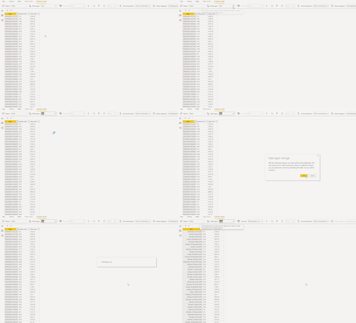
For the time intelligence to work, the format of the column needs to be Date. Some times when importing information PowerBI sets the data type to text... To change it back, click the drop down next to 'data type' and select 'Date' then click 'yes' to the following alert.
Reason No. 3 - Date is actually date and time
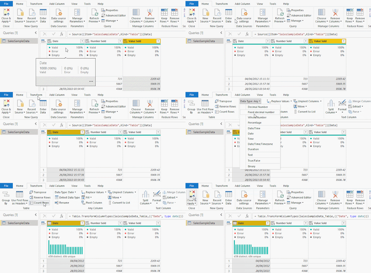
For the time intelligence to work, both columns need to include the date only and not the time. As you may have seen from the image above, the date in the sales table includes the time of sale. To modify the column, one way to do this is to transform the data in the query to Date.
Reason No. 4 - Unit format is incorrect
Just as the format of the date columns is critical, so to is the format of the columns of the data you wish to aggregate. In this example, the Number sold and Value sold columns were incorrectly formatted as text. The steps required to fix this are similar to the date format outlined earlier, but this time the format is changed to whole or decimal number.
Assuming there are no other issues, your file should look something like the following. The X axis isn't as aesthetically pleasing as it could be but the data displayed by day is now correct.
Information and links to the data used in this example
In this example I've used the 'Sample Sales Data' dataset (click here to download), it has 3 columns containing the following:
Date - Random date and time between 2011 and 2013
Number Sold - Random whole number between 10 and 10,000
Value Sold - Random, 2 decimal number between 100 and 10,000
And also used the Dax Date table from my previous blog post:
DateTable = Generate(CALENDAR (date(2010, 1, 1) , today()),
row("DayNo",day([Date]), // Date for calculations
"Day ddd", Format([Date], "ddd"), //day name, Mon, Tue, Wed, etc
"WeekNo", WEEKNUM([Date]), // Gregorian week number
"WeekDay", if (or (Format([Date], "ddd") = "Sat", Format([Date], "ddd") = "Sun"), 0, 1), // 1 if the date is a week day
"WeekDayNum", WEEKDAY([Date], 2 ), // Number from 1-7 based on the week day
"Week", [Date] + 7 - Weekday([Date], 2), // Last date of the week
"MonthNum", MONTH ( [Date] ), // Number of the gregorian month
"MonthName", FORMAT ( [Date], "mmmm" ), // Long name of current Month
"MonthEnd", EOMONTH( [Date], 0), // Date of the last day of the month
"Year", Year([Date]) // Year of the base date
))


Comments
Post a Comment